Role
Lead UX Designer
Client
Polestar
Timeline
Jun 2020 - Jul 2021
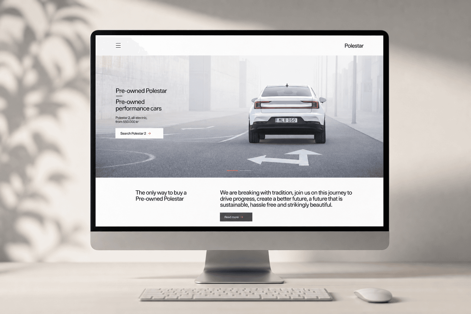
An hassle-free and premium buying experience for a pre-owned Polestar
End-to-end UX for a pre-owned car buying flow and a dealer-facing management portal — from journey mapping to launch across 4 markets.
The challenge
Polestar wanted to launch a pre-owned buying experience that felt as premium as buying new — but the challenge went beyond one product. I was designing three connected experiences at once: the customer purchase flow, a dealer inventory portal and an order management tool. Each had different users, needs and teams involved, so keeping the journey consistent while moving fast was the real challenge.
What I did
I led the UX across all three workstreams: mapping the service, running sessions with Polestar’s internal teams and the external partner, and designing the customer flow and both dealer-facing portals. A junior UI designer supported the visual execution, while I owned the shared Figma file and overall UX direction.
The outcome
We launched in Belgium in April 2021 and rolled out to four markets. Internal stakeholders and dealers responded positively. We didn’t have formal metrics at launch — something I would set up earlier next time.
The goals
Business goal
Polestar needed a scalable digital channel for pre-owned sales — one that didn't rely on manual processes or third-party platforms. The goal was to own the full experience, from inventory to purchase, under the Polestar brand.
Customer goal
Buying a pre-owned car online is still a high-anxiety decision for most people. The goal was to give customers enough information, transparency and confidence to complete a purchase without needing to call a dealer or visit a showroom.
The problem space
Designing for pre-owned was more complex than it first appeared: each car had different mileage, condition, history and price, which made filtering and listing logic more complex than a new car configurator. The work also had to fit into Polestar’s existing design system and portal ecosystem, while serving both customers buying a €30k car online and dealers managing inventory without training. In practice, I was designing three connected products at once — the buying flow on polestar.com, an inventory management tool and an order management portal — and when the business decided to bring the solution in-house, we had to quickly rethink ownership, dependencies and handoffs across teams.
What success would look like
A live, functional buying experience that felt premium and trustworthy — on par with Polestar's new car experience.
Process highlights
Understanding the full picture before designing anything
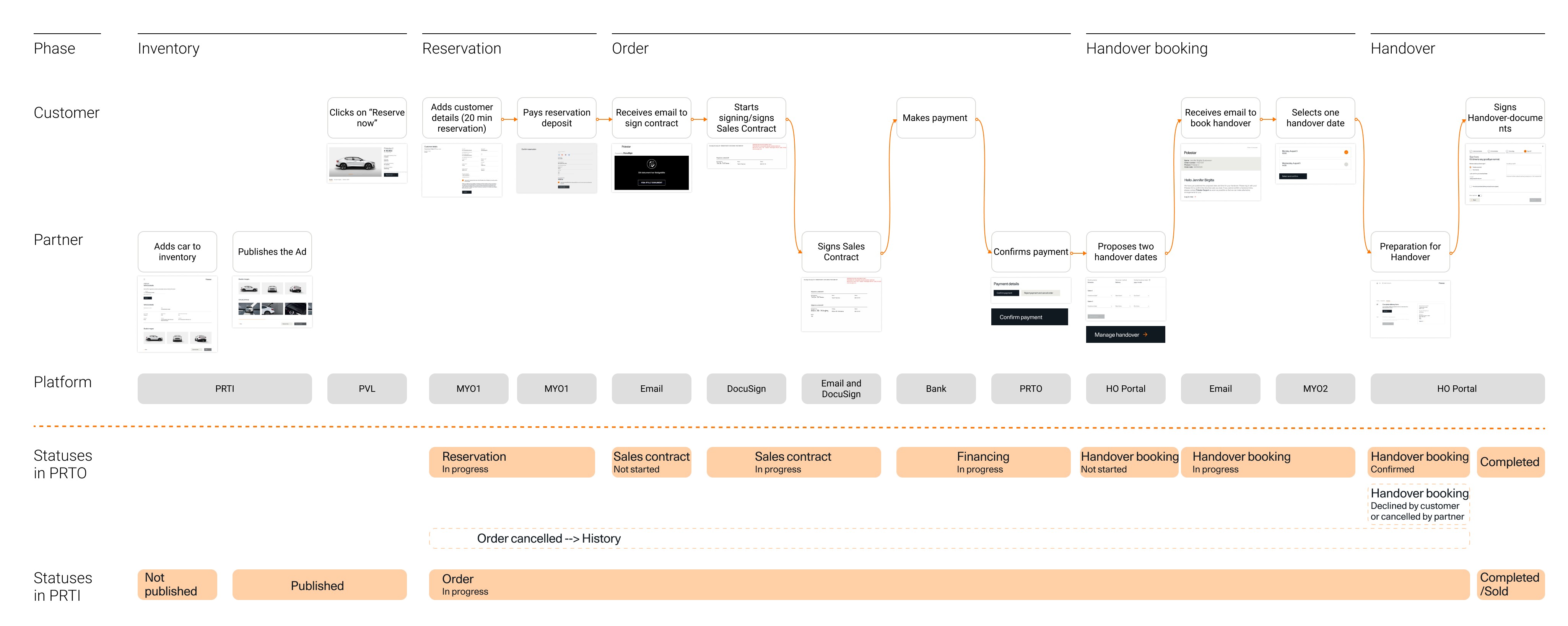
I started by reviewing the service blueprint that had already been produced by other team members, then mapped a high-level journey of the entire pre-owned experience. I presented this to different teams to get alignment on what the experience needed to cover — from the moment a customer lands on the listing page to the moment the car is delivered.
Acquisition
Partner acquires a pre-owned car
Inventory
Car details are added to the portal
Purchase
Customer buys the car online
Order management
Partner manages the order
Purchase
Car is delivered to the customer
Coordinating ownership across changing teams
The project started with an external partner responsible for parts of the inventory and order management infrastructure. This created three connected workstreams — the customer buying experience, inventory portal and order portal — each with different teams, priorities and mental models.
I helped keep the experience coherent by mapping ownership, running alignment sessions and bringing separate inputs into a shared product view.
Inventory management team
Search car, add details, take photos, publish it
Pre-owned website team
Program benefits, car listing, car info, purchase flows
Order management team
Order follow-up, financing, agreements, car delivery planning
When the business later decided to bring the solution in-house, we had to quickly remap responsibilities and redesign handoffs so the full journey still worked as one connected experience.
Key decision - building without the external partner
The decision to develop everything internally came from the business, not from design. But it had real design consequences — we suddenly owned the full system, including parts that had been planned around a third-party product. We had to be more deliberate about consistency and handoff across the three portals.
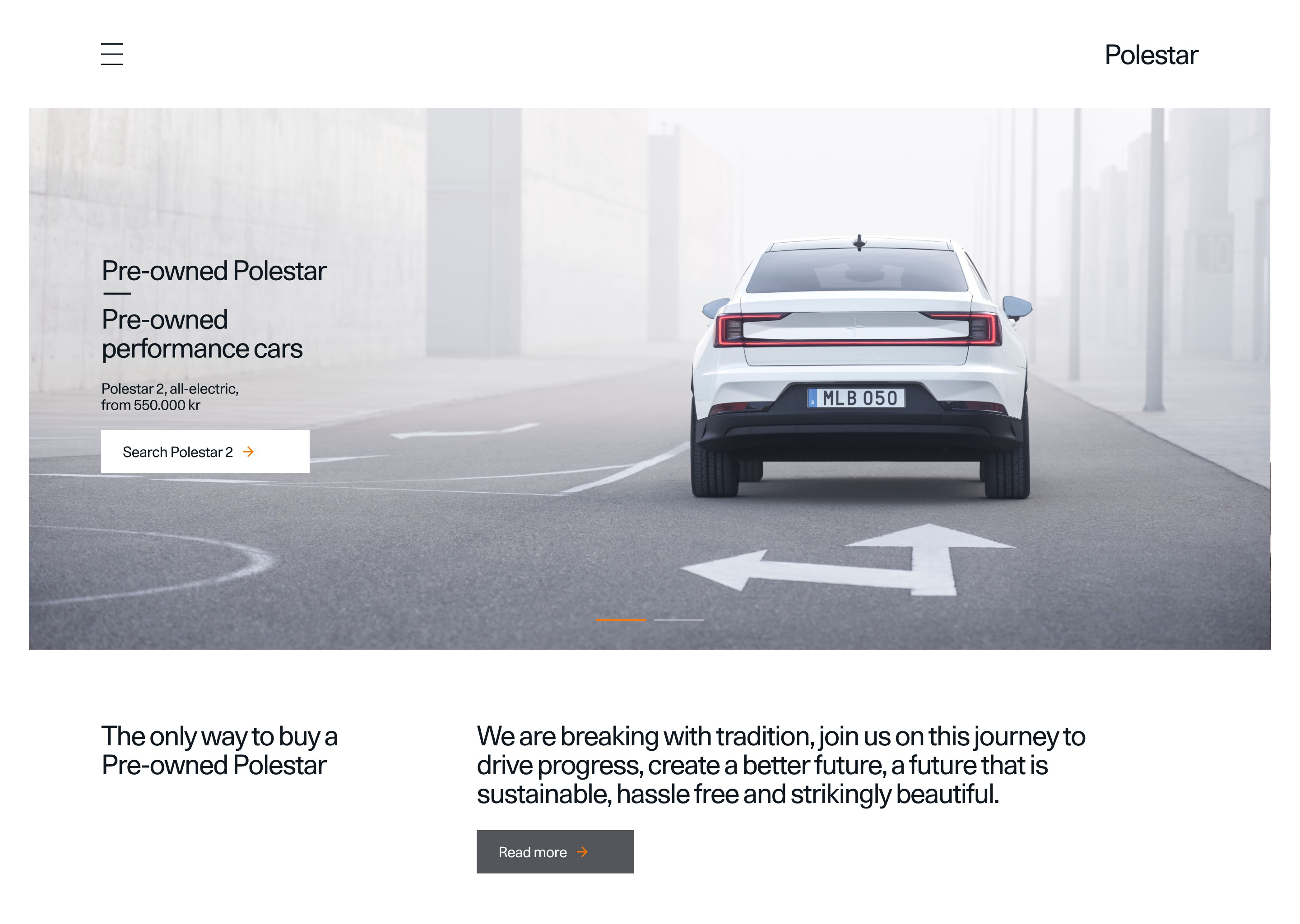
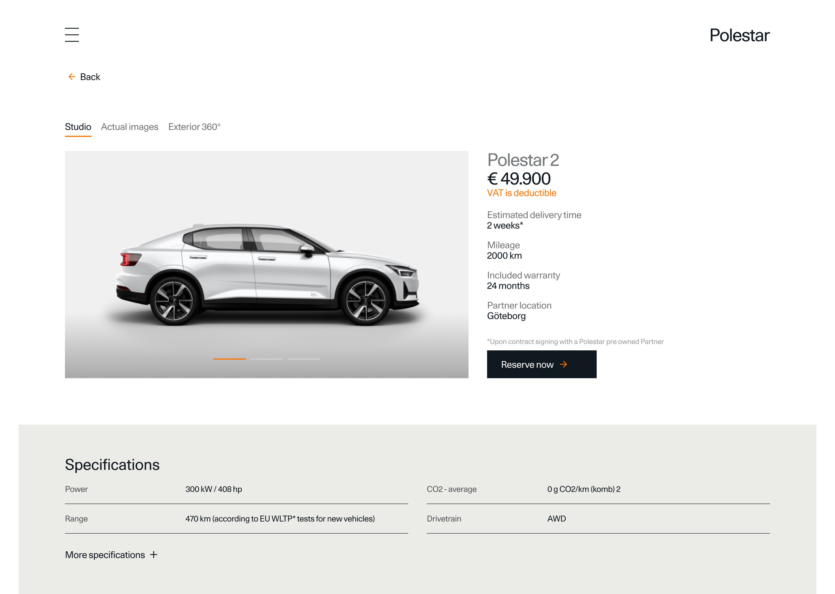
Defining the key screens for the customer flow
Together with the other designer on the project, I identified the screens we needed to prioritise for the buying flow: the listing page, the filter experience, the individual car page, and the purchase flow. I led the UX decisions on structure and hierarchy; he supported on visual execution.
Key screens of the customer facing experience — listing, filtering, and product detail.
Key decision - how to handle filters
Filtering pre-owned inventory is trickier than it looks. After researching how other automotive sites handled it, I decided to show the most important filters directly on the page and group secondary filters in a separate section. There are many filters, but most customers use only a few — so the design needed to surface the right ones without overwhelming the page.
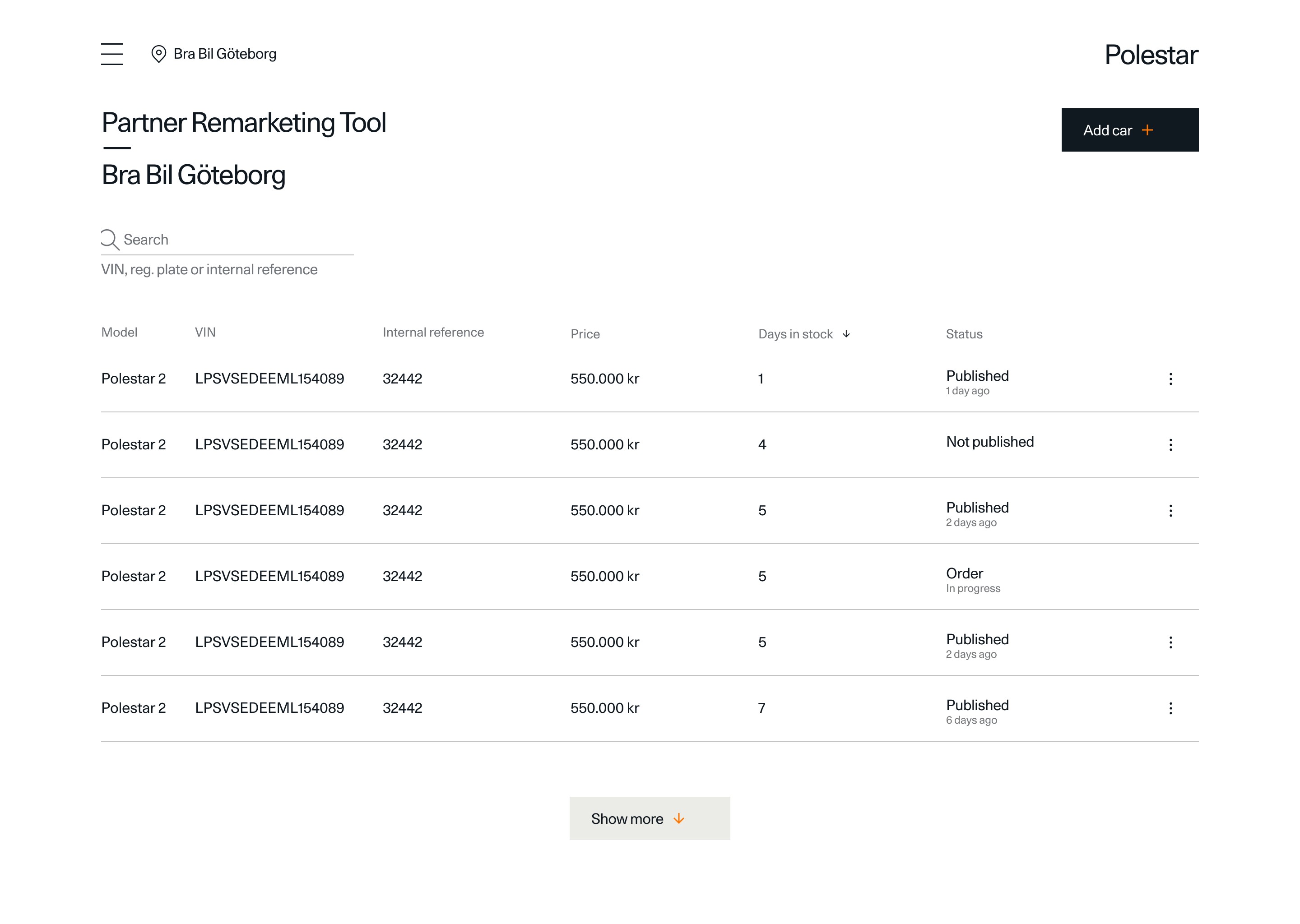
Designing the dealer portal
The dealer-facing side of the product was just as important as the customer flow. Dealers needed to manage their inventory, track orders, and handle pricing — all in one place. I mapped the dealer journey from their perspective first, then defined the key screens: inventory management, order tracking, and pricing.
The dealer portal had to work for people with different roles — inventory managers, sales teams, and delivery coordinators — and be well connected to the customer facing experience
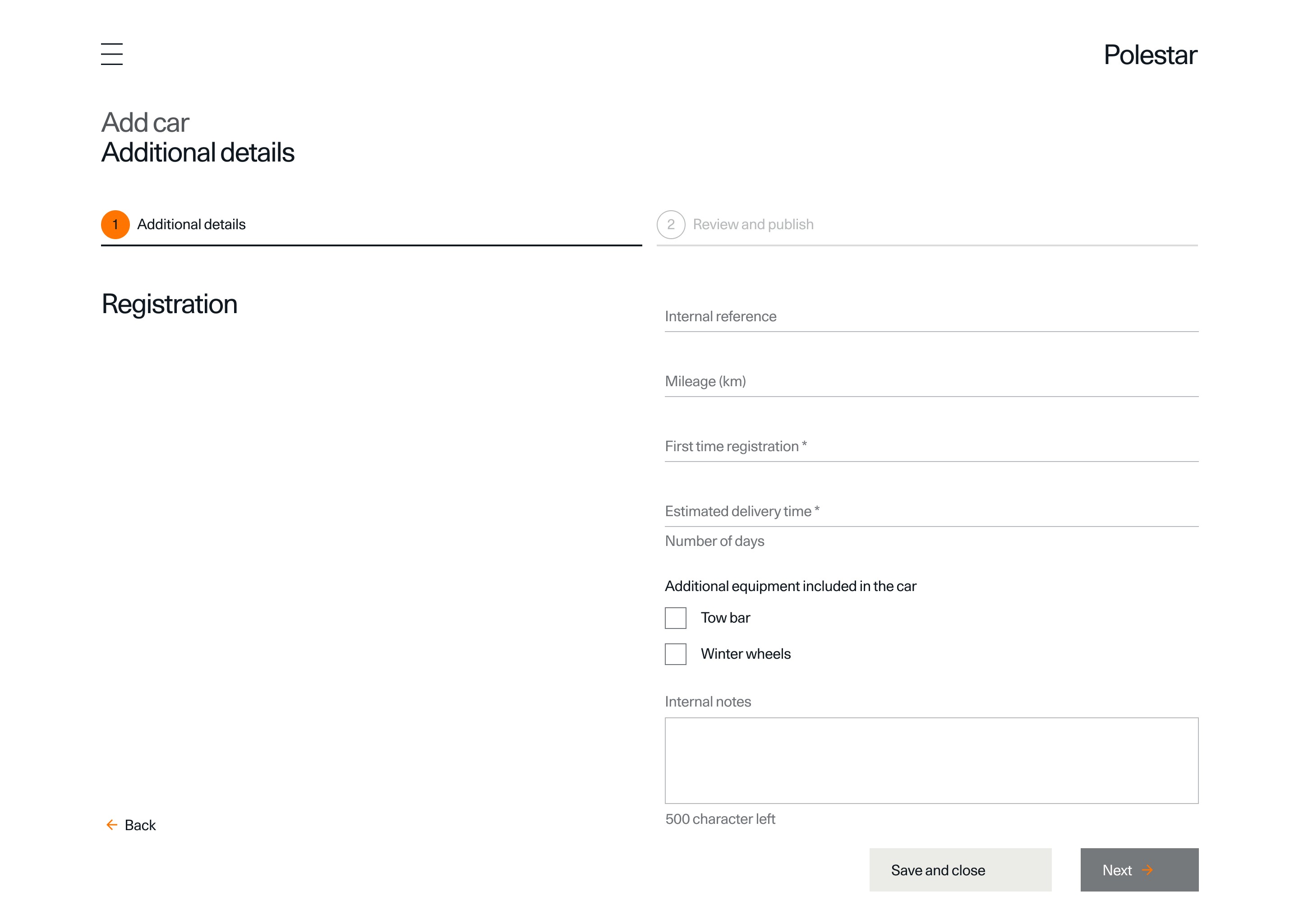
From wireframes to high fidelity
I moved from paper wireframes to high-fidelity designs, keeping consistency with Polestar's existing portals. The challenge was adapting common design system elements to a new context while making sure the portal felt coherent for users who already worked in other Polestar tools.
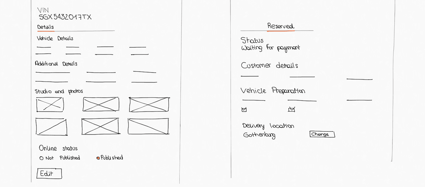
Low-fidelity screens of the dealer portal - adding a car to the inventory
I moved from paper wireframes to high-fidelity designs, keeping consistency with Polestar's existing portals. The challenge was adapting common design system elements to a new context while making sure the portal felt coherent for users who already worked in other Polestar tools.
By the end, I had designed two fully distinct products: the customer-facing pre-owned experience on polestar.com, and the dealer-facing portal covering inventory management and order tracking — all consistent with Polestar's existing design system and maintained in a single Figma file.
Key screens from the customer-facing pre-owned experience on polestar.com
Key screens from the dealer-facing portal covering inventory management and order tracking
Launch
Launched in Belgium, then rolled out market by market
We went live in April 2021, starting with Belgium. From there, Polestar rolled out the experience market by market. Internal stakeholders were positive about the outcome, and car dealers — the main users of the partner portal — responded well to the tool.
Reflections
Working across a complex ecosystem takes more upfront alignment than you expect. This project involved internal teams, an external partner, car dealers across multiple markets, and a business that was making structural decisions mid-project. Getting everyone on the same page early — and staying aligned when things changed — was as much a part of my job as the design itself.
The decision to cut the external partner mid-project was a real lesson in designing under changing constraints. When the scope changed, we had to rebuild our understanding of who owned what. I learned to map dependencies explicitly — not just design flows, but ownership and handoff.
We didn't have metrics in place at launch, and I'd do that differently. The feedback from stakeholders and dealers was positive, but we couldn't measure what actually changed for customers. Setting up even basic tracking — conversion, drop-off, time on page — should have been part of the brief from the start.
What I'd do differently: push earlier for a defined measurement framework. Not because the project failed — it didn't — but because good qualitative feedback isn't enough to know what to improve next. Metrics give you a reason to come back to the design with evidence.
How we measured success
We didn't have formal metrics in place at launch — something I'd push for earlier next time. In practice, success looked like a live product that worked across four markets, dealers who could use the portal without hand-holding, and stakeholders who felt the experience matched Polestar's brand. That was the bar we set, and we hit it.
Comments from the team