Role
UX Designer
Client
Volvo Cars
Timeline
Oct 2017 - Sep 2018
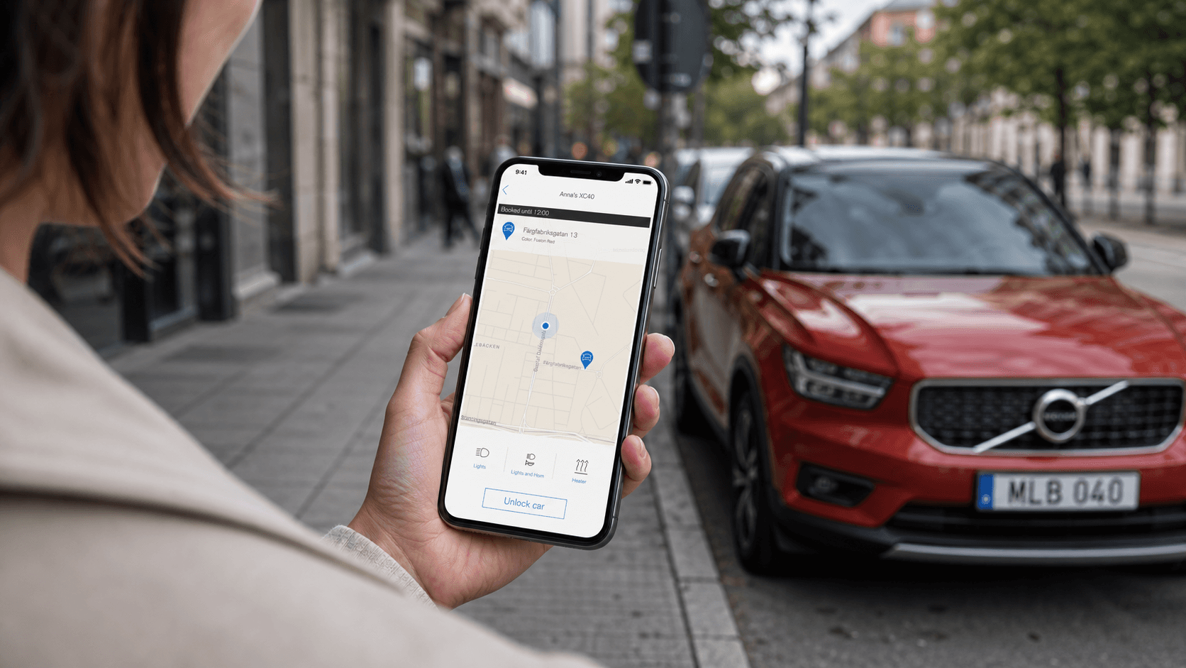
Lend your car to friends and family with an app
A new feature for Volvo On Call that replaces the physical key handover with a digital one.
The challenge
Car sharing with commercial services like Car2Go is something most people know. Lending your own car to a friend or family member is something completely different. The challenge was to design that experience — and understand what the real barriers to doing it actually were.
What I did
I was the sole UX/UI designer on a team of 7 developers, 1 product owner, 1 business analyst, and a consumer insights manager. I worked across the full process: research, concept, interaction design, UI, and a large-scale pilot study with real users.
The outcome
We launched the MVP in under 6 months. A pilot study with 37 participants in Spain revealed key usability problems. I redesigned the booking flow between the two research series and validated the new version — which users rated as significantly better.
The goals
Business goal
Extend Volvo On Call beyond existing car owners. A guest who borrows a Volvo through the app is a potential future Volvo customer. The feature also explored new use cases for the digital key technology Volvo was already investing in.
Customer goal
Owners wanted a simple, trustworthy way to let people borrow their car — without physically handing over a key. Guests just needed it to feel easy: receive an invite, confirm, drive.
The problem space
The hardest part wasn't the technology — Volvo already had the digital key infrastructure. The challenge was the concept and the behaviour around it.
When people heard "car sharing," they thought of commercial platforms. That association shaped everything: tone, terminology, how formal the booking flow felt.
What the pilot study revealed was something deeper: sharing a car is not a natural behaviour for most people, even with people they trust. Concerns about damage, insurance, and losing control of an expensive possession were real. The app couldn't solve those by itself — but it could make sharing feel safer and more manageable.
What success would look like
A working MVP that users could interact with naturally, backed by research that showed us what to improve next.
Process highlights
Explorative research — understanding users' first reaction
We worked with an external agency in London to run a research study with 10 participants — 5 owners, 5 guests — before development started. I observed from a separate room while their researcher ran the sessions.
The concept was well received. The prototype was easy to use. But the tone felt too formal and the language pointed straight to commercial services. The booking system felt too rigid for lending a car to someone you know.
The prototype we took into the London sessions. Easy to navigate, but the framing felt more like renting than lending.
Key takeaways
Tone and terminology too close to commercial car sharing
Missing explanation of how the service actually works
Booking with fixed time slots felt too restrictive
Designing the access model
Different people in an owner's life have different needs. A spouse might need the car at any time. A colleague might only need it for one specific weekend.I mapped out the key relationships and scenarios and designed a permission model with different access levels — always-on access for trusted people, on-demand access requiring the owner's approval, and a time-limited key for occasional use. The design work was done and the model was defined, but it wasn't implemented in the product due to business prioritisation.
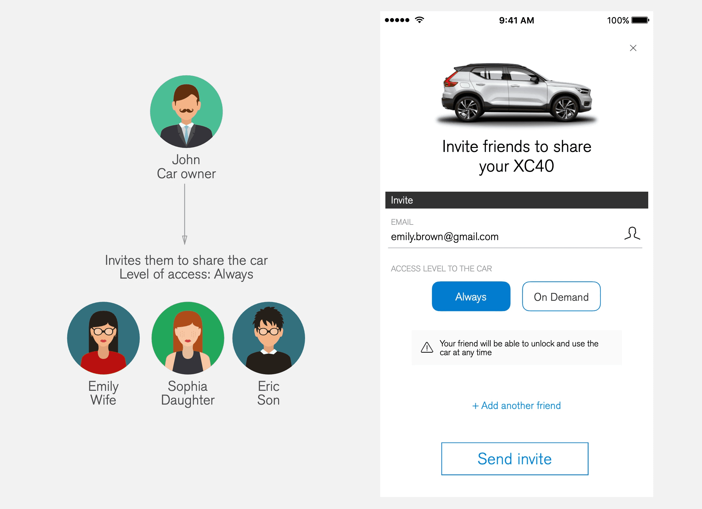
Owners could choose the access level for each guest — permanent for a partner or family member, on-demand for a friend
Key decision - Start with one market, not all
Trying to design for all markets at once would have added too much complexity before we'd validated anything. Focusing on Sweden let us move faster, test the full flow end-to-end and learn before expanding. The rollout to other markets was always part of the plan — just sequenced deliberately.
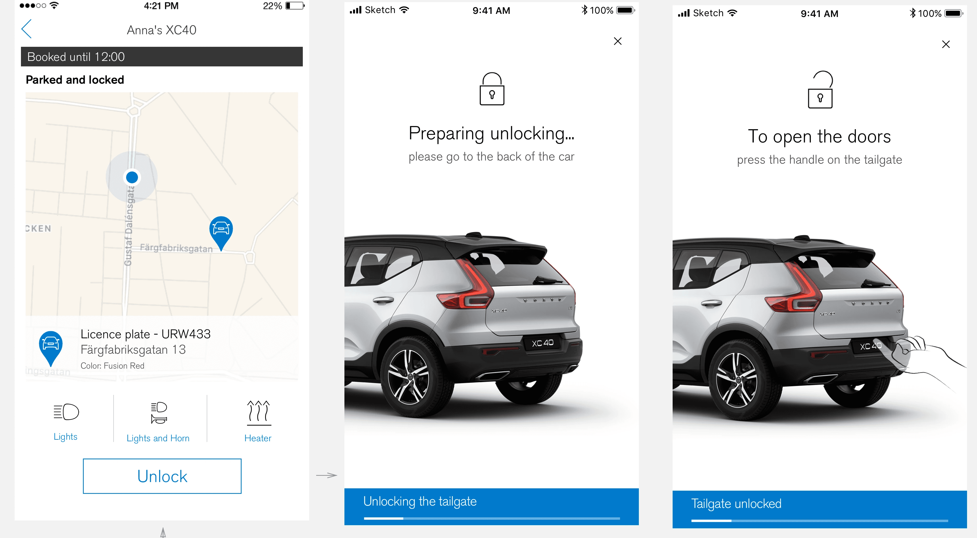
From prototype to launch in under 6 months
I iterated the design through multiple rounds of internal feedback and alignment with the Volvo On Call design system. The MVP covered the full owner and guest flows end-to-end.
Video showcasing the owner and guest flows
Spanish pilot study — 37 participants, two research series
After the MVP launched, we ran a structured pilot study. We gave 21 participants access to an XC40 for 2 months to use as their own and share with people they trusted.
Group 1: 10 owners, April–June 2018 → interviews in Madrid, June
Group 2: 11 owners, June–July 2018 → interviews in Madrid, September
Total interviews: 37 (owners + their guests), semi-structured, 45–60 min each
Key decision - redesign the booking flow between the two series
Group 1 interviews revealed consistent problems: users couldn't see car availability, couldn't book more than 5 days ahead, and couldn't modify a booking once made. Some owners had created their own colour-coded calendars to manage this. I designed a new booking calendar before Group 2's interviews and tested it with the second group.
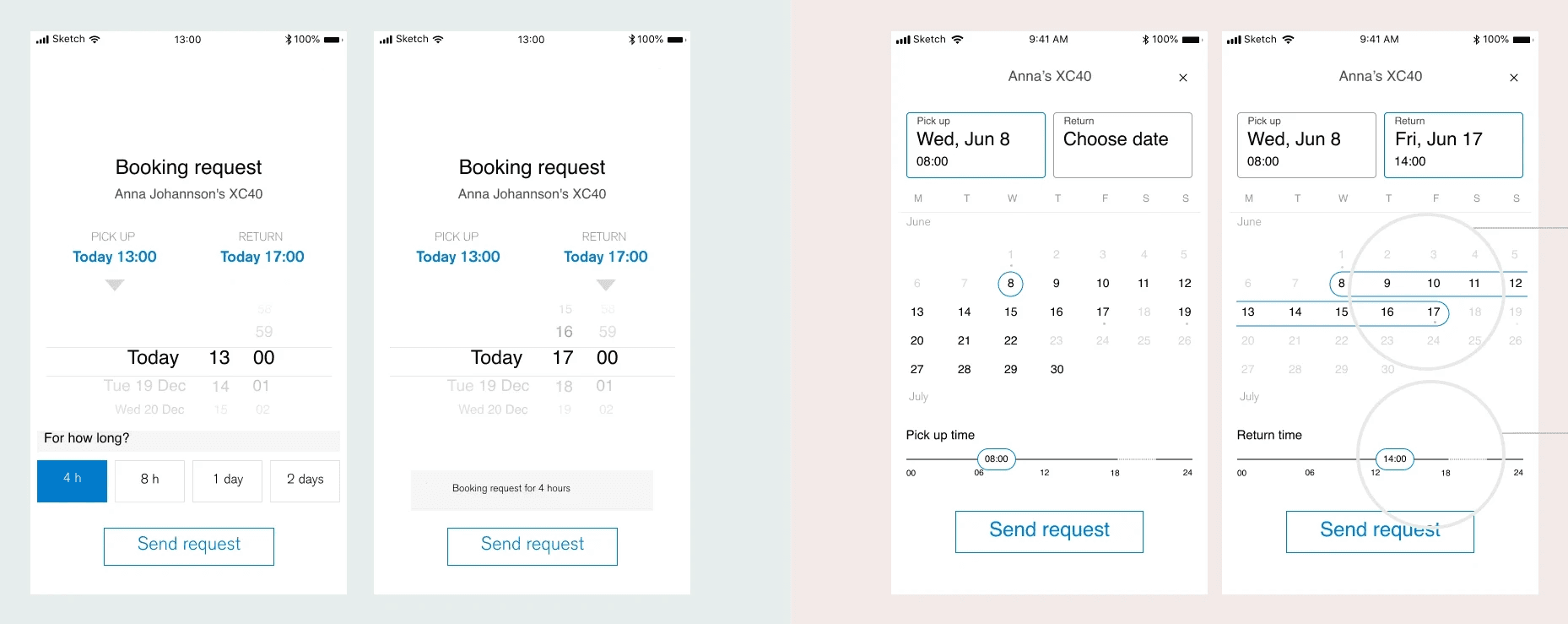
Before/after comparison of the redesigned booking calendar.
Group 2 feedback on the new calendar:
10 out of 19 participants mentioned it unprompted as a clear improvement
Most successfully completed a test booking without help
"Way more intuitive than it was before, easier to pick date and time." — Guest, Group 2
What the research told us beyond the app
The pilot study also revealed something important about the concept itself: sharing a car is not a natural behaviour, even with people you trust.
The main barriers were concerns about damage, insurance, and losing control. The experiment helped reduce these partly because participants knew the car belonged to Volvo — not truly to them.
The digital key was the strongest positive signal throughout. Owners felt more comfortable giving digital access than handing over a physical key, because they kept partial control.
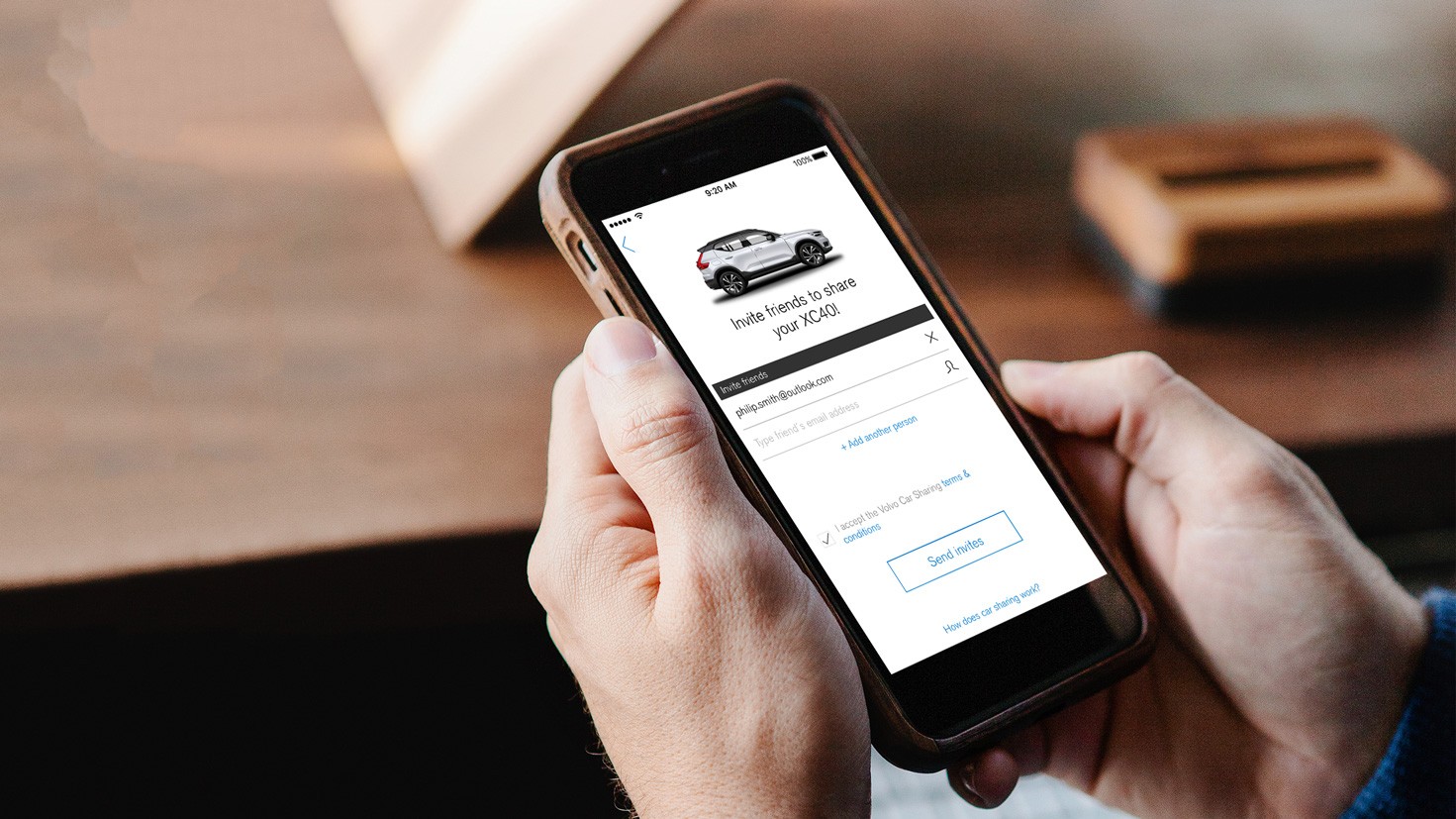
The email invite, however, didn't match how friends communicate. 7 out of 19 owners didn't have their guests' email addresses and had to ask for them. Most coordinated via WhatsApp instead. This finding directly led to work on a third-party invite flow.
"With the physical key, you give the responsibility of it all. With the app you have more control." — Owner
"Pretty cool not having to meet people when you want to lend them your car." — Owner
"I don't have people's email at hand" — Owner
"The app is clear, easy to use and there are not too many screens to complete an action." — Guest
"I would only share with really really close family. I'm not sure about friends. It depends." — Participant
"The guest can have this and see the availability so he doesn't have to ask me first." — Owner
Outcome
The feature launched progressively across European markets with the Volvo XC40. It received press coverage at launch from The Verge, Men's Health, and DriveSweden.
The pilot study gave the team a clear evidence-based direction for what to prioritise next — the invite flow, Android reliability, and the longer-term question of whether the service should evolve toward a structured P2P model.
Reflections
Iterating between research series made the research actionable. Rather than waiting for all 37 interviews to finish, I redesigned the booking flow between Group 1 and Group 2 and validated it with real users in the second round.
App reliability undermined the experience in ways design couldn't fix alone. 11 participants perceived the app as slow and 7 Android guests had connection problems. I used the research readout to make a direct case for prioritising these issues — because no UI improvement would matter if the app failed when someone was standing in a car park trying to unlock a borrowed car.
What I would do differently. I didn't define success metrics before the pilot study. I'd push for that upfront now — activation rate, average bookings per owner, guest conversion. The qualitative picture was rich; the quantitative layer was missing.
How we measured success
We didn't have quantitative metrics in place for this feature. Success was measured qualitatively — through two rounds of research with real users, and through the product team's ability to make informed decisions about what to build next.
The clearest signal was the booking redesign: we tested the new calendar with Group 2 and the feedback was consistently positive, which confirmed the direction before committing to development.